With regard to the Component Wizard, we have reviewed the data source and the settings for creating a new item. This time, let's take a look again at the Background Image, which is a setting for Behaviors.

Configuring XM Cloud's Component Wizard - Part 3 Background image
XM CloudHeadless SXAPublished: 2024-10-07
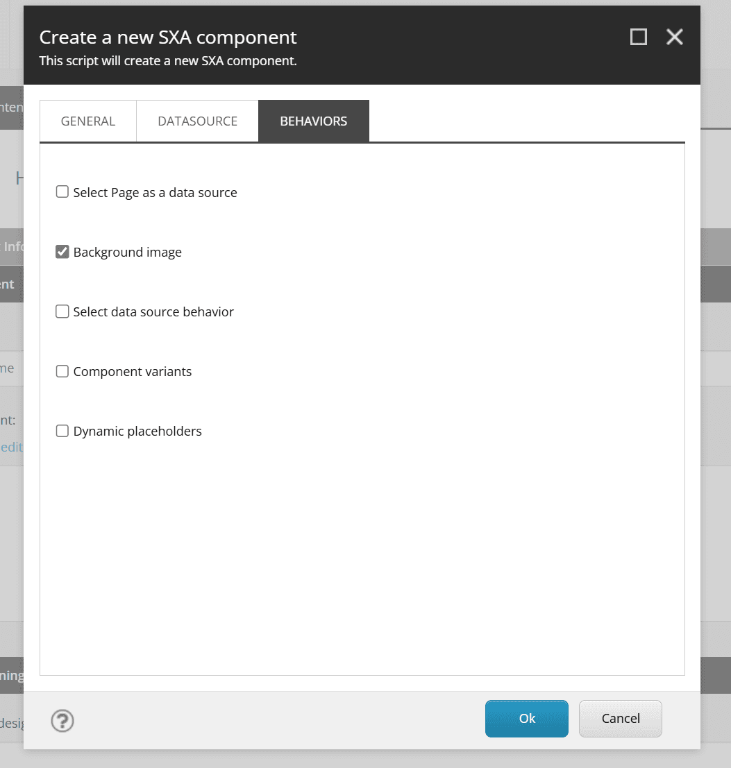
Check rendering settings
If Background Image is checked this time, the rendering is no different than for an unchecked item.
Check template settings
If Background Image is checked for a template, _Background Image is added to the selection.
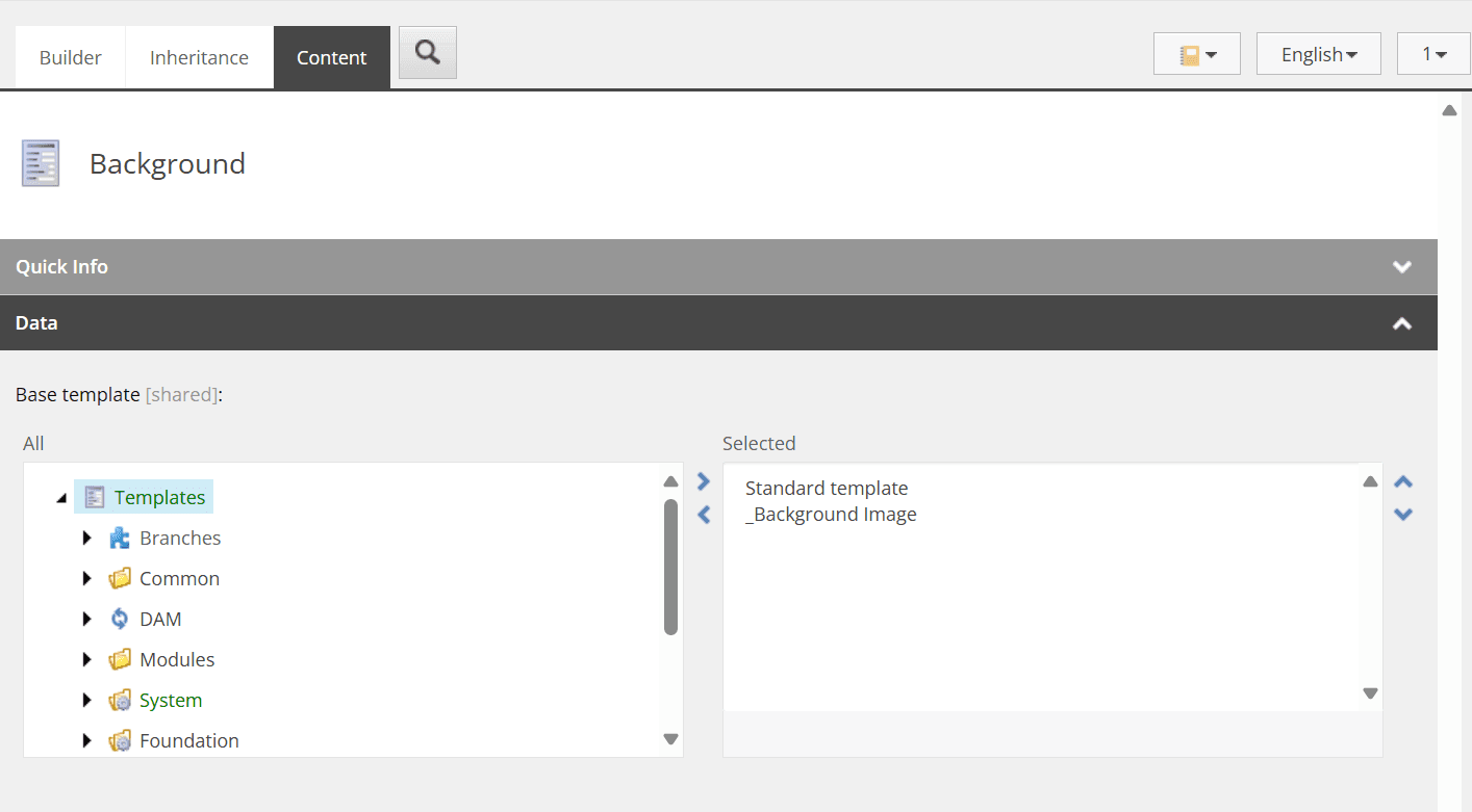
This template is defined in /sitecore/templates/Foundation/Experience Accelerator/Presentation/_Background Image, which defines fields for the background image and its display method. background image and how it is displayed.
Therefore, it is necessary to create an item in order to use the Background Image component. Therefore, when creating the component, the data source must be set to automatically create data source under page, which is defined in Rendering Experience Accelerator's Other Properties of the Experience Accelerator and set IsAutoDatasourceRendering to true.
This completes the preparation.
Operation check with various tools
First, place the Background component you created, which is shown below in the Experience Editor.
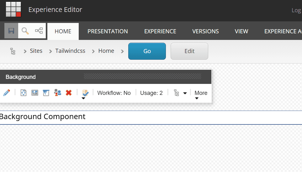
The third icon from the left that is not normally displayed appears. What happens when you click on this?
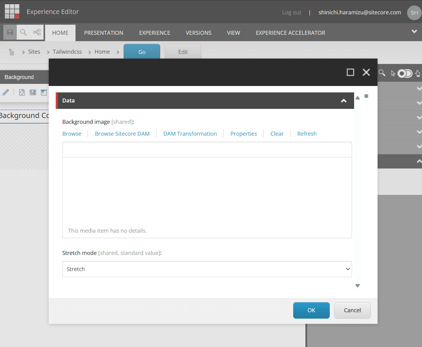
When I go to check the item in the content editor, I see the same data.
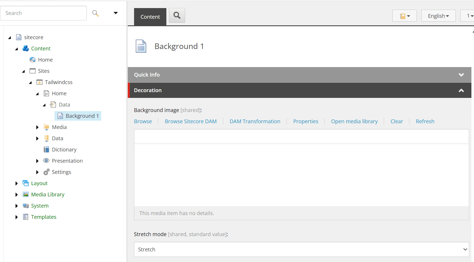
Thus, items related to background images can be added as standard.
Background ImageImage implementation
In fact, there is a standard component that implements the background. The Container component can be configured for background images. For example, if you place a Container in Pages, you can specify an Image in the Parameters section.
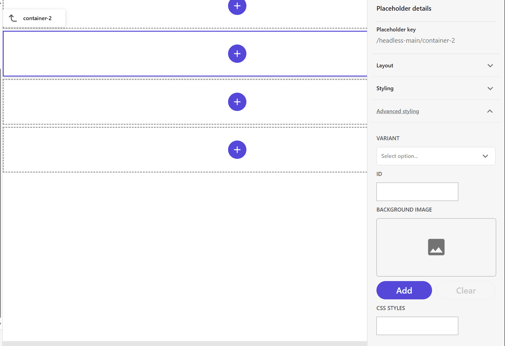
First, re-create the component with the following settings
- Datasource - User current page
Then add an Image field for Rendering Parameters.
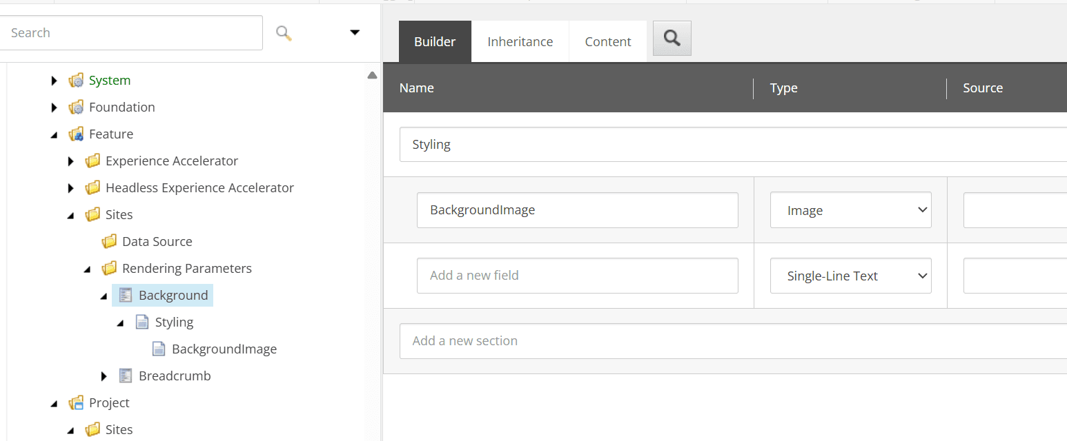
This allows the selection of images for the Pages style, as shown in the following figure.
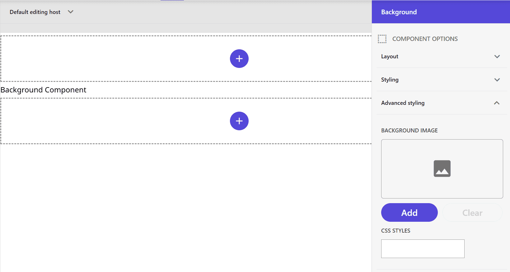
It is now possible to specify a background image when using the Experience Editor.
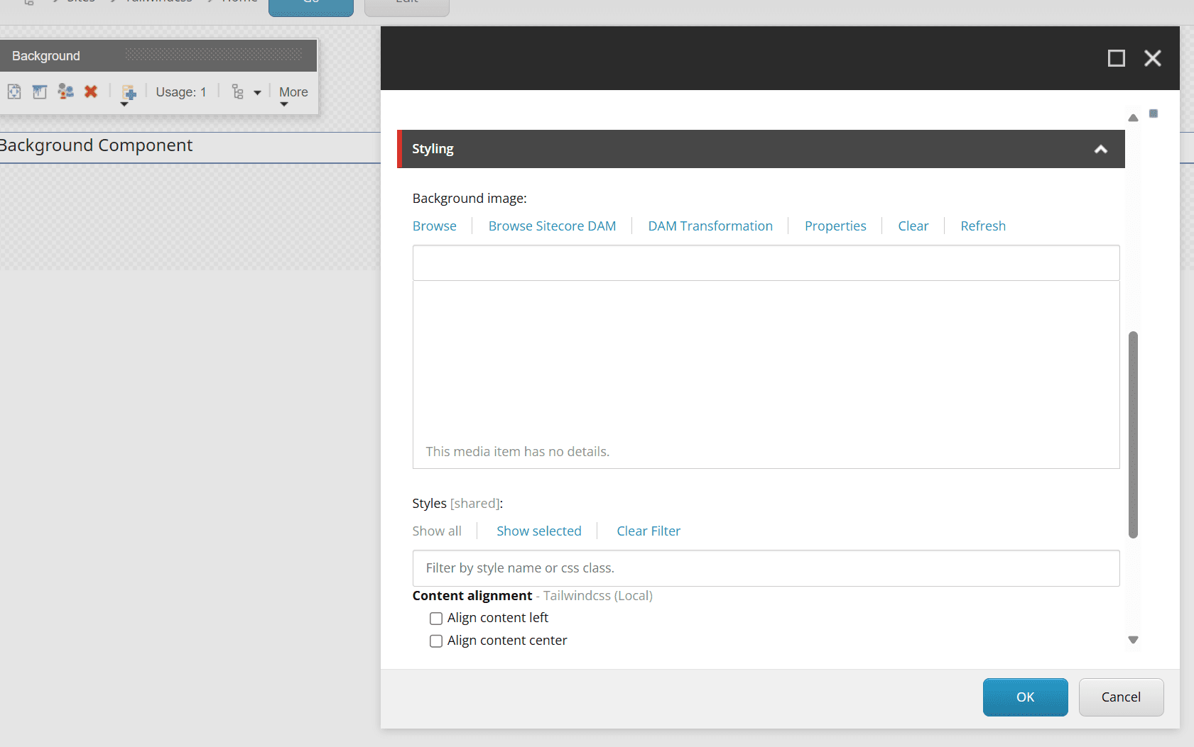
Which implementation is better?
The method of specifying a Background Image in the Component Wizard can be used to meet the need to hold data as an item and use it as a background image. However, this item cannot be set using Pages.
For this reason, it is recommended that images be included in the Styles introduced later so that they can be changed in the Pages settings screen. This item is also available in the Experience Editor.
Summary
In this case, we started by checking the behavior of the Background image in the Component Wizard, but in practice, it is not recommended to use this item; the best practice is to write it like the Container code that creates a component that can be edited in Pages. The best practice is to write it like the Container code.