The sample already in operation at hand uses Tailwind.css, but we would like to go one step further and apply NextUI this time. This is a user interface tool provided by Vercel, which offers Next.js.

Install NextUI
The installation procedure for Next.js is described in the following page.
Sitecore's XM Cloud is created with Next.JS's Page Router. In this article, we will follow the procedure. First, install the necessary packages.
npm i @nextui-org/react framer-motionNext, we will modify the Tailwind CSS settings: update the tailwind.config.js file; import NextUI, add content and darkMode (see the official site for the code).
The last step is to set up the Provider. This description is to be added to pages/_app.tsx.
      <NextUIProvider>
        <I18nProvider lngDict={dictionary} locale={pageProps.locale}>
          <Component {...rest} />
        </I18nProvider>
      </NextUIProvider>
Creating Test Components
Create a component to check if NextUI is enabled. In this case, we will create a TestComponent. This is simply done with a wizard, so we will skip the steps (Reference: Headless SXA - Using the Component Wizard).
The sample code is also created by executing the following command
jss scaffold TextComponentThe code produced is as follows
import React from 'react';
import { ComponentParams, ComponentRendering } from '@sitecore-jss/sitecore-jss-nextjs';

interface TestComponentProps {
  rendering: ComponentRendering & { params: ComponentParams };
  params: ComponentParams;
}

export const Default = (props: TestComponentProps): JSX.Element => {
  const id = props.params.RenderingIdentifier;

  return (
    <div className={`component ${props.params.styles}`} id={id ? id : undefined}>
      <div className="component-content">
        <p>TestComponent Component</p>
      </div>
    </div>
  );
};
Change the P tag portion of TestComponent Component in the above code to the following code, and also change the import of Button.
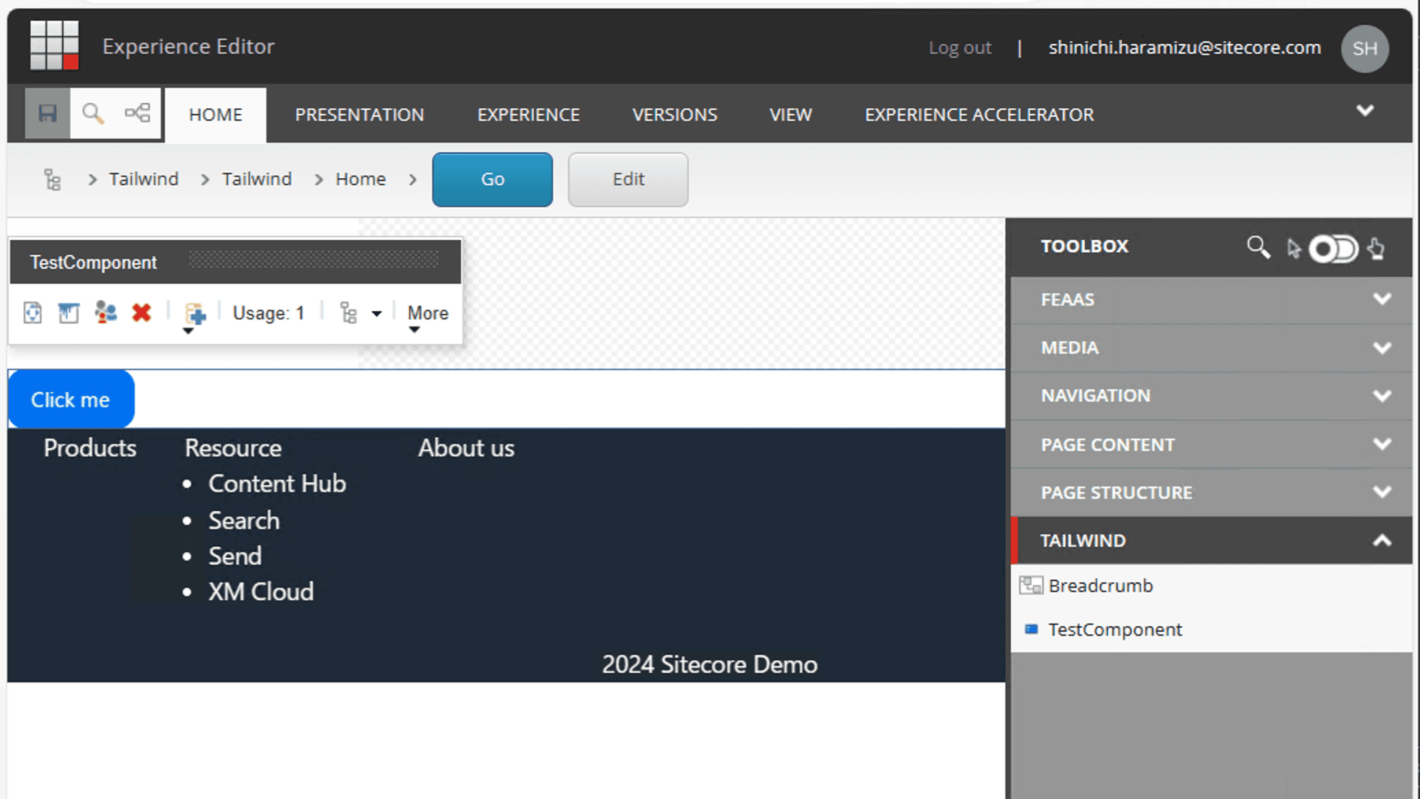
<Button color="primary">Click me</Button>After placing this button, we were able to confirm that the NextUI button could be placed as shown below.

Summary
For someone like me who has no sense of design, it is helpful to use the interface provided by NextUI to provide something that looks a little better. So, I would like to create it from here in a way that uses the mechanism of Tailwind and NextUI.