Previously, we created fixed images and text for the components and pasted them onto the page, but this time we want to add our own template and use that data to render the components.

Creating New Components
In this case, we created a simple one with images and text placed as components.
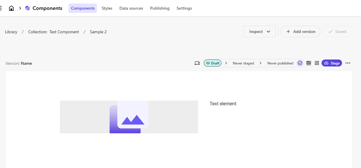
Images and text are assigned to this layout.
Create a template
To create a dedicated template for use with this component, open Pages and click on Teampletes in the left menu.
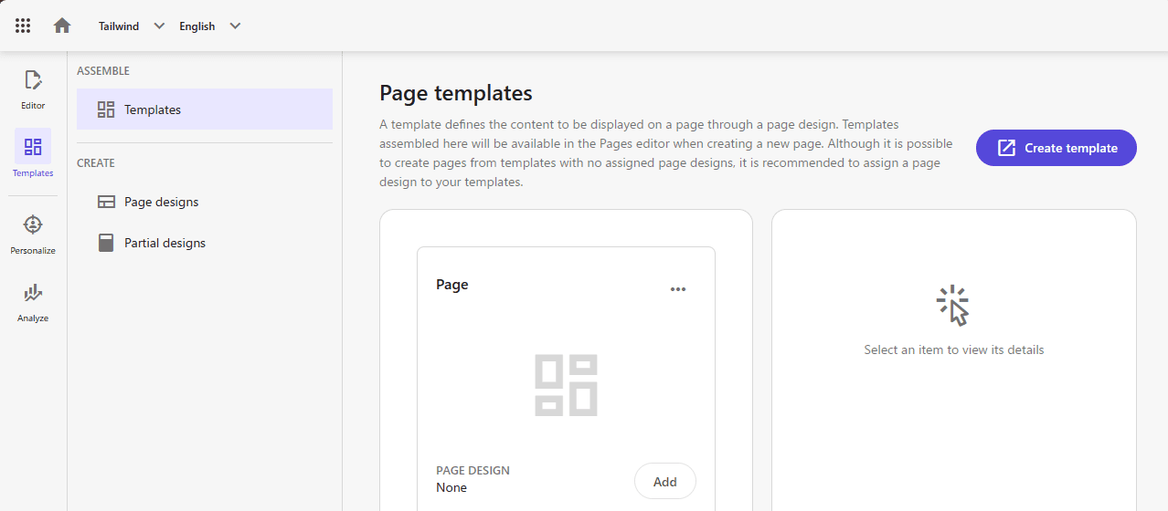
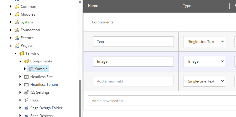
Click on "Create template" to go to the content editor. In this case, since there is already a default template in Tailwind under Project, we will create a folder called Components to distinguish it, and create a template called Sample.
Using this created template, create a sample item for the Data folder in Home.
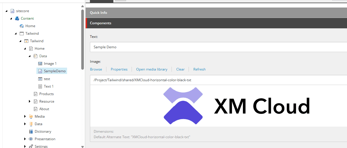
This completes the preparation.
Registering a template with FEaaS
In order to be able to use the template structure we have created with Sitecore Components, please select the FEaaS compnent data source tempates in the site's Settings. Service, which is the name of the mechanism to work with Sitecore Component.
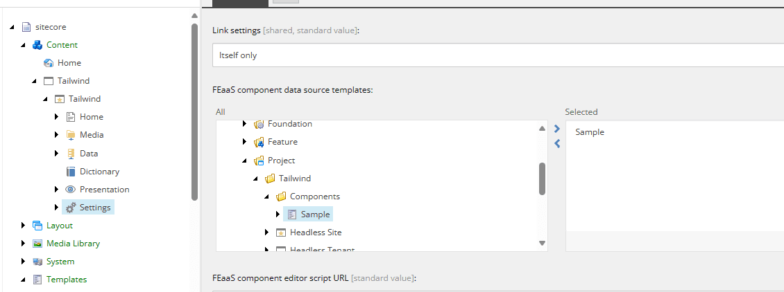
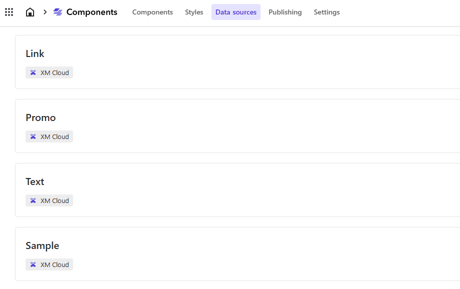
After implementing this setting, the data source will automatically appear as a candidate in the Components data source.
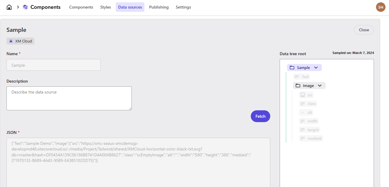
When you select an item, you will see that the data from the sample you have already created has been added as a JSON sample.
Tie data sources together
When you are ready to tie them together, open the target component again in the Components screen. The working point is to map image values to images and text to text. In this case, we worked as follows
The image is in an odd shape in terms of size, etc. because I made it as I went along. I made a few corrections.
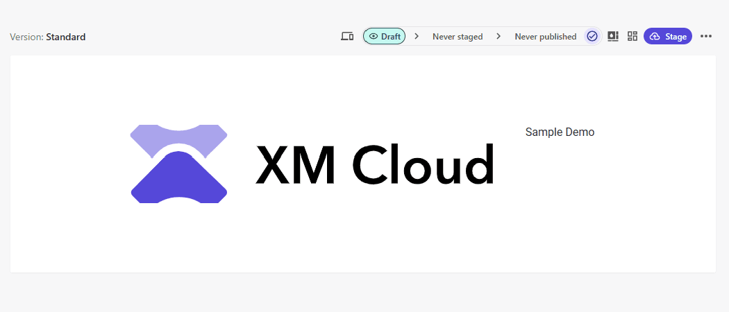
We will proceed with the following steps to this.
- Add Version
- Tailor the version to the device
This completes the preparation of the component.
Go to Pages, place the component, and assign the item to be displayed.
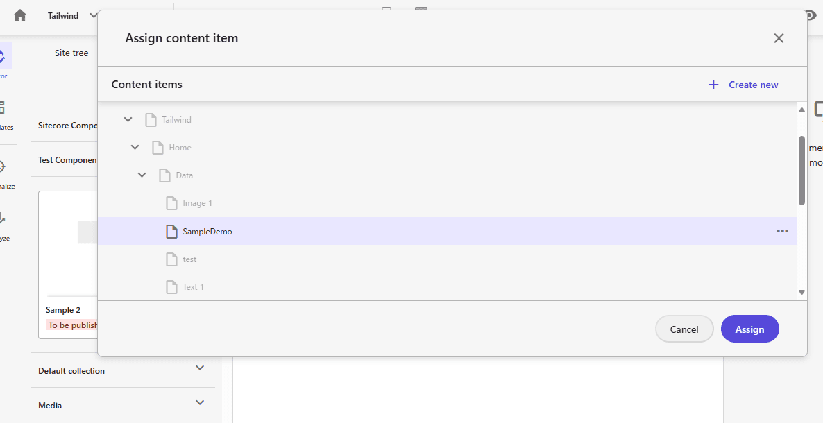
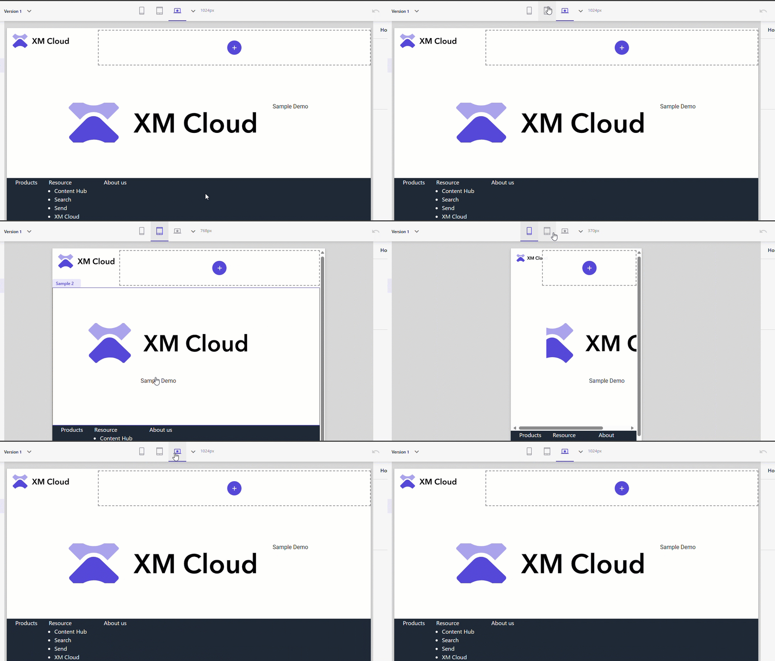
You can verify that it is enabled by placing the component and switching devices.
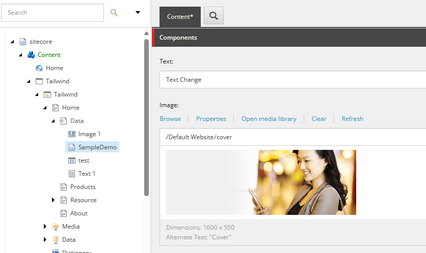
Update item data
To verify that the component is correctly referencing the data source, the item's data is first updated.
Check the components again in Pages.
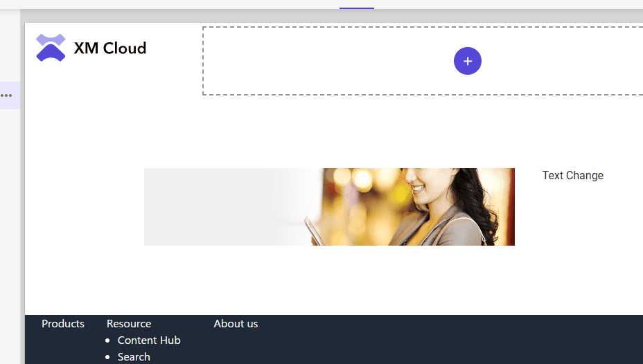
We have confirmed that the image and text have been changed.
Summary
We have tested this time with only images and text in the component. Of course, if you want to add more elements, you can add items by setting them in the template. By setting up workflows and timers for the items, it is possible to publish and version control the contents of the component.
Last time we were able to create components with no code, and this time we were able to work with templates with no code. being able to create components without having to create them in Headless SXA is a useful feature in terms of ROI.