We have been able to verify the application of style sheets by component, but there is a style mechanism available in Pages. We will check the behavior with respect to this.

Style Definitions
Styles that can be used in Pages are provided by default. In this article, we will check the operation of these styles.
About Spacing
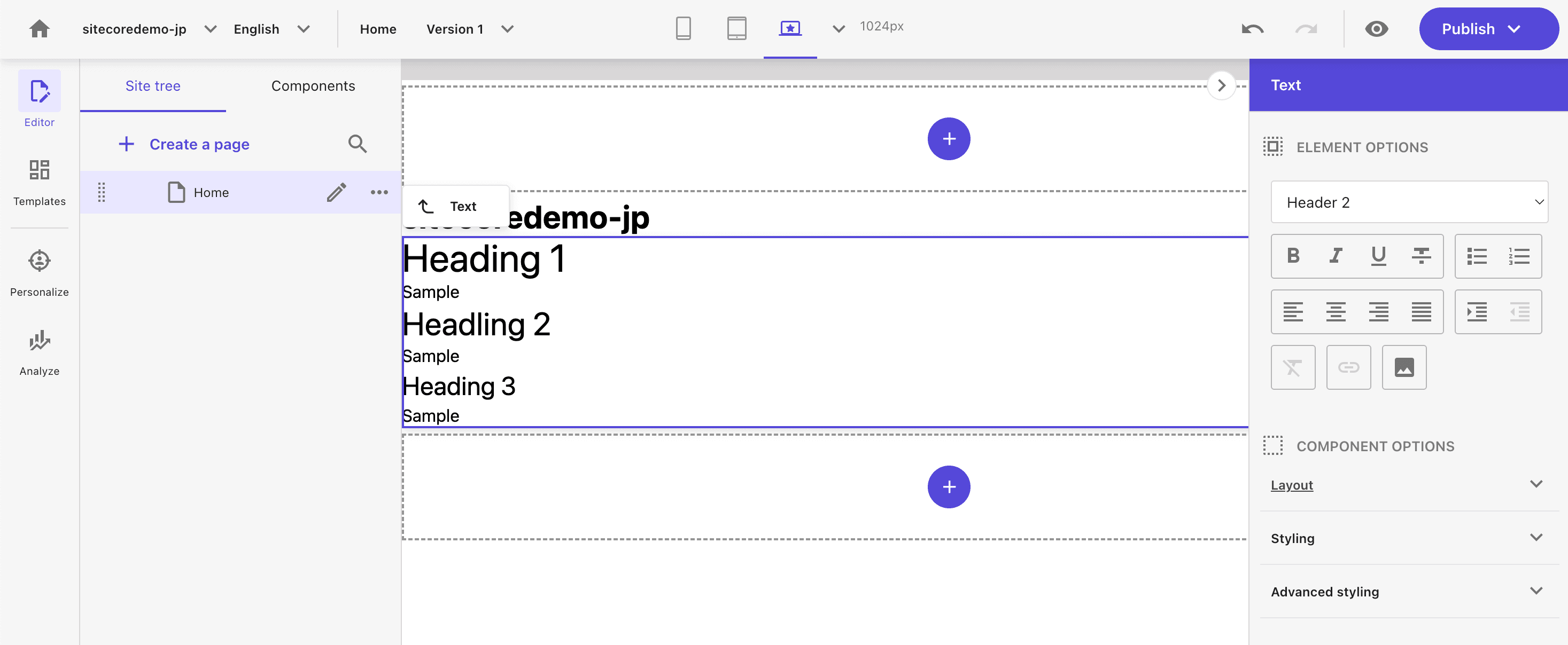
When you select a rich text item in Pages, the selection available changes with the style of the item on the right.
This definition is an item that is defined as the style of the site. For example, the following is the definition for spacing.
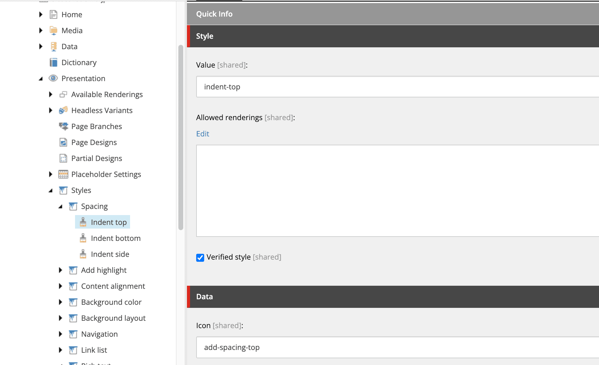
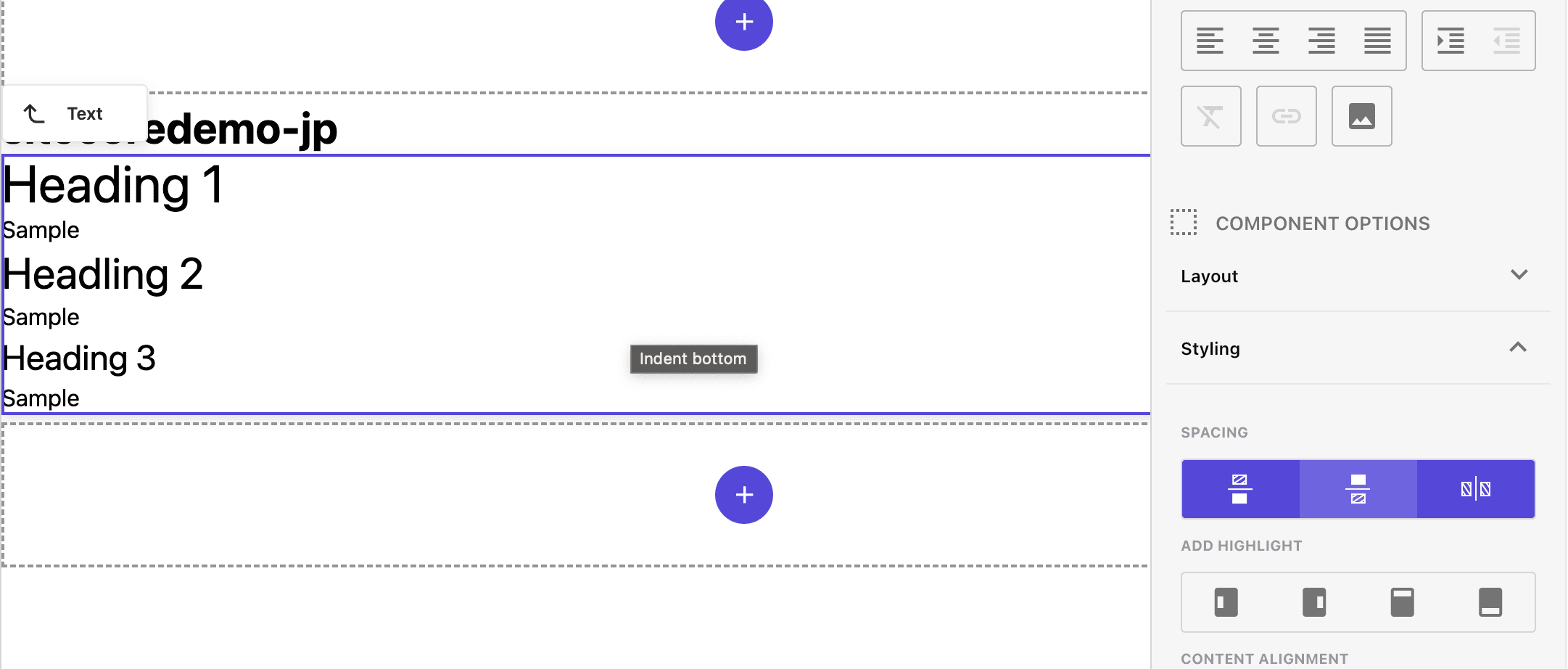
For example, what happens when you click on the indent-top icon? If you check the code, the code will be added as follows
<div class="component rich-text basis-full indent-top">
  <div class="component-content">
    <div>
      <h1>Heading 1</h1>
      <p>Sample</p>
      <h2>Headling 2</h2>
      <p>Sample</p>
      <h3>Heading 3</h3>
      <p>Sample</p>
    </div>
  </div>
</div>
The value to be added, indent-top, is set to the value defined in the item. Add a style for this indent-top to take effect across the board. Add the file src/assets/components/Common/spacing.css and add the following code
.indent {
  @apply ml-6 mr-6;
}
.indent-top {
  @apply mt-6;
}
.indent-bottom {
  @apply mb-6;
}
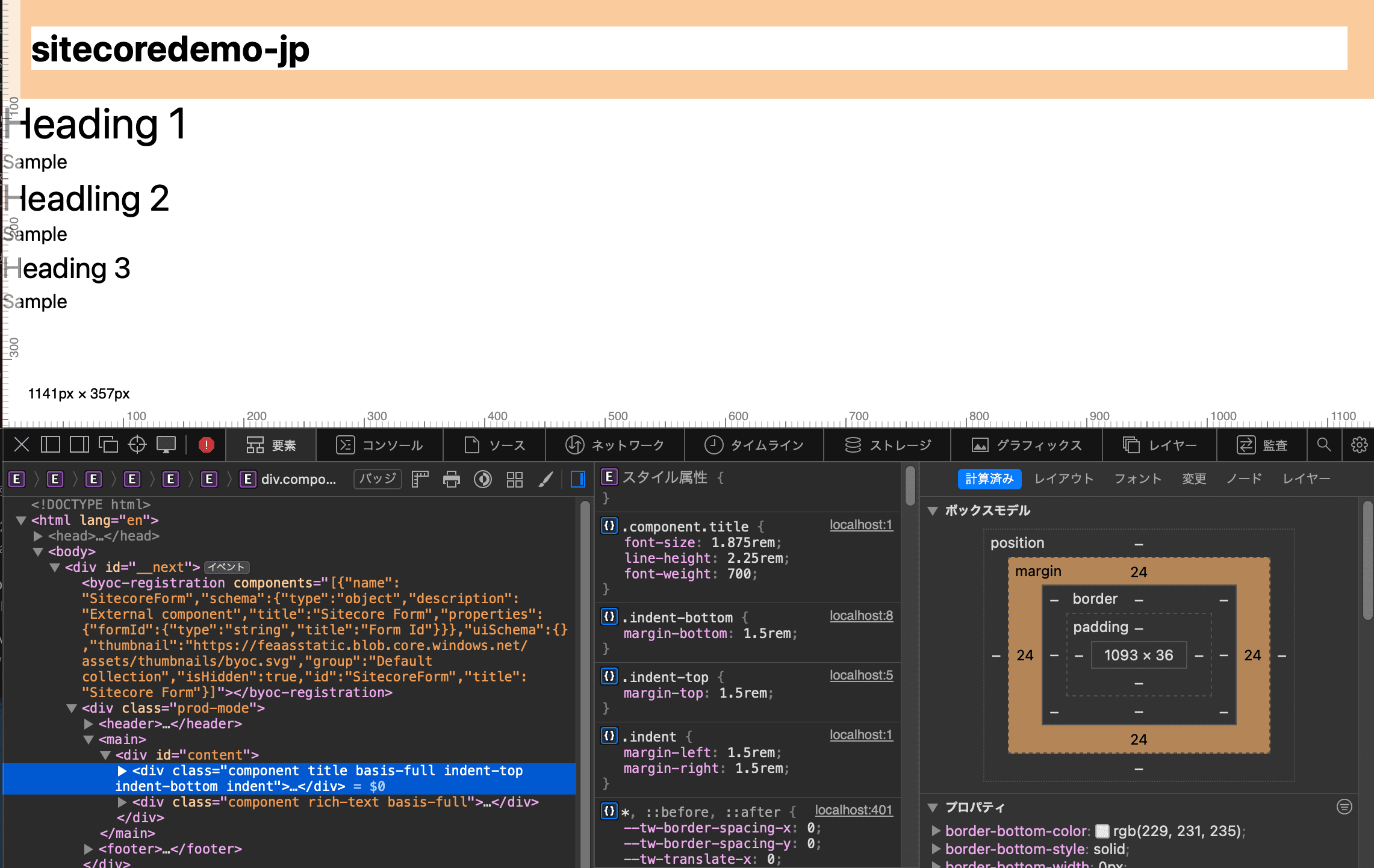
Once you have the above file, import it in globals.css. Now you are ready to go. Check everything and view the page to see that the margins are set.
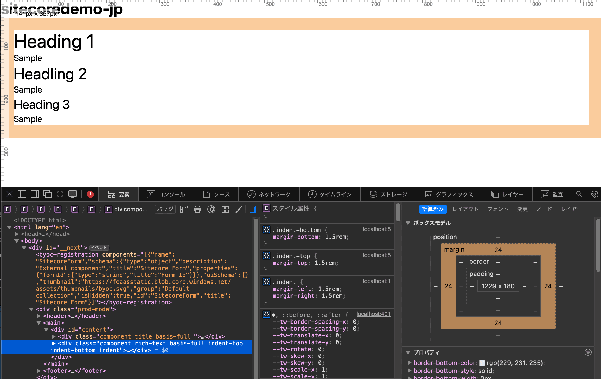
Since it is common to all components, it works when applied to Title.
About Content Alignment
Next to Styles, we will examine Content Alignment, which can be used in the form of right-aligning or centering. This is available in the form of right-align or center-align. Note that only one of these can be selected for this item. This difference is due to the difference in the Style group settings.
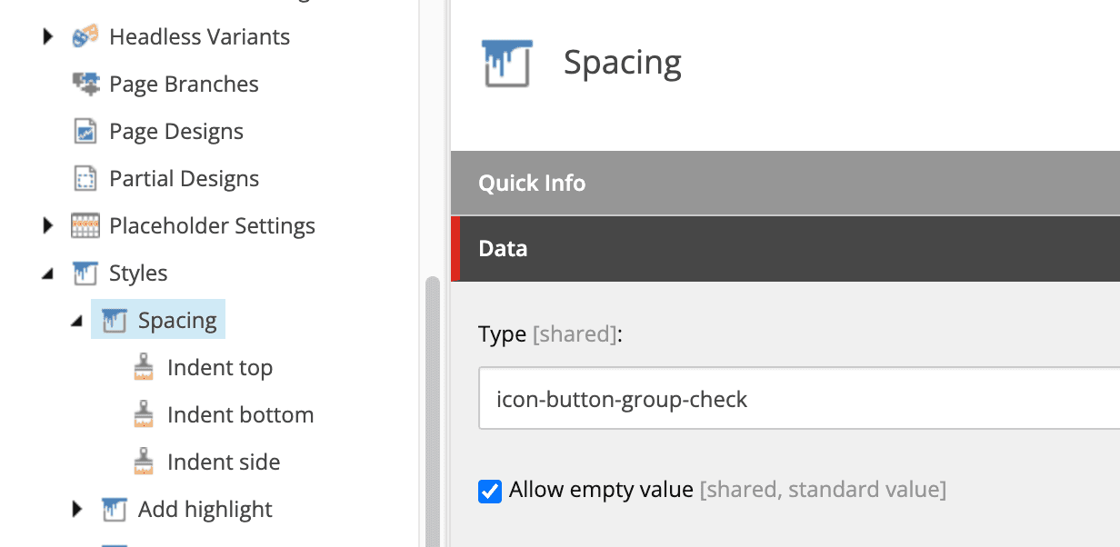
Spacing is defined as follows and is a checkbox-like move.
And as for Content Alignment, it is defined as a radio button.
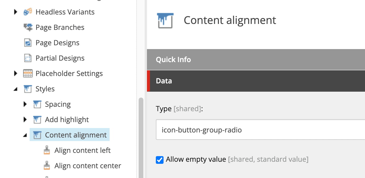
For this reason, only one of them can be selected. Now, let's create and apply the file src/assets/components/Common/alignment.css.
.position-left {
  @apply text-left;
}

.position-right {
  @apply text-right;
}

.position-center {
  @apply text-center;
}
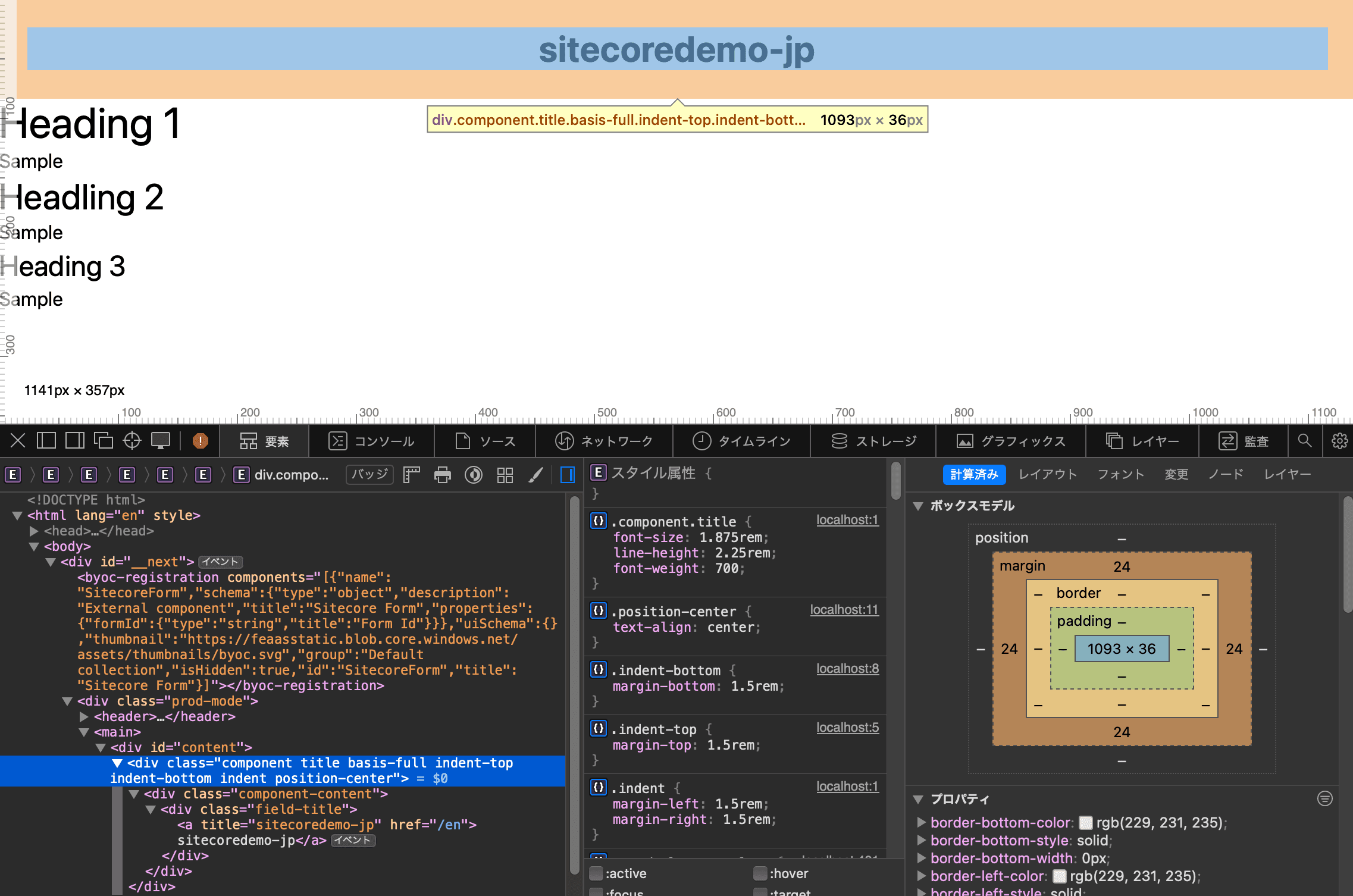
Once you have the above file, import it in globals.css. Now you are ready to go. When you actually click on the middle button, the text will now be displayed in the middle.
Summary
In this article, we have set up the styles to use the items embedded in Pages. In the next article, we will examine the standard component Column Splitter.