For the various fields provided by Sitecore, we will actually implement them in a single component and verify their operation.

Component Creation
First, create a component called types, this time following the steps on the following page.
The general procedure is as follows
- Wizard to create the items needed for the component
- Create a Single-Line Text field for Text1 in the /sitecore/templates/Feature/Demo/Data Source/Types template created
- Register the created component as an available rendering in the Presentation - Available Renderings section of the SXA site.
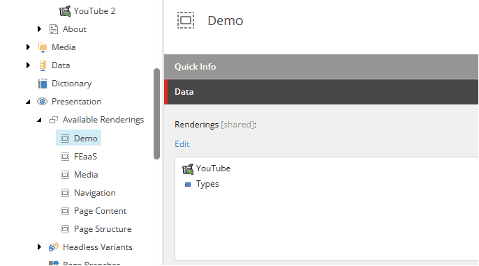
You have now added the component. Next, create the file src\rendering\src\components\Types.tsx as a component just for displaying this text, and write the following code.
import React from 'react';
import { Field, Text } from '@sitecore-jss/sitecore-jss-nextjs';

interface Fields {
  Text1: Field<string>;
}

type TestProps = {
  params: { [key: string]: string };
  fields: Fields;
};

export const Default = (props: TestProps): JSX.Element => {
  return (
    <div className={`component myrendering ${props.params.styles}`}>
      <div className="component-content">
        <div>
          <strong>Text field: </strong>
          <Text field={props.fields.Text1} />
        </div>
      </div>
    </div>
  );
};
When ready, paste the component at the bottom of the home page.
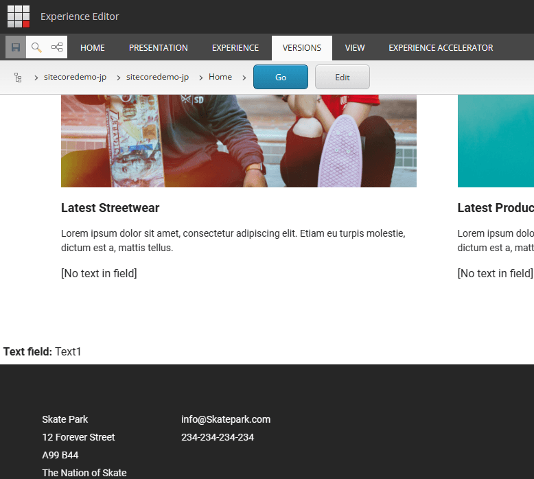
First, we now have a component that displays a simple field.
Handling of Fields
The following definitions are used for the fields available in Sitecore.
Using these fields, you can also define items that can be edited in the Edit As You See It screen (Experience Editor and Pages).
First, as for the template, we will update it with more fields as follows.
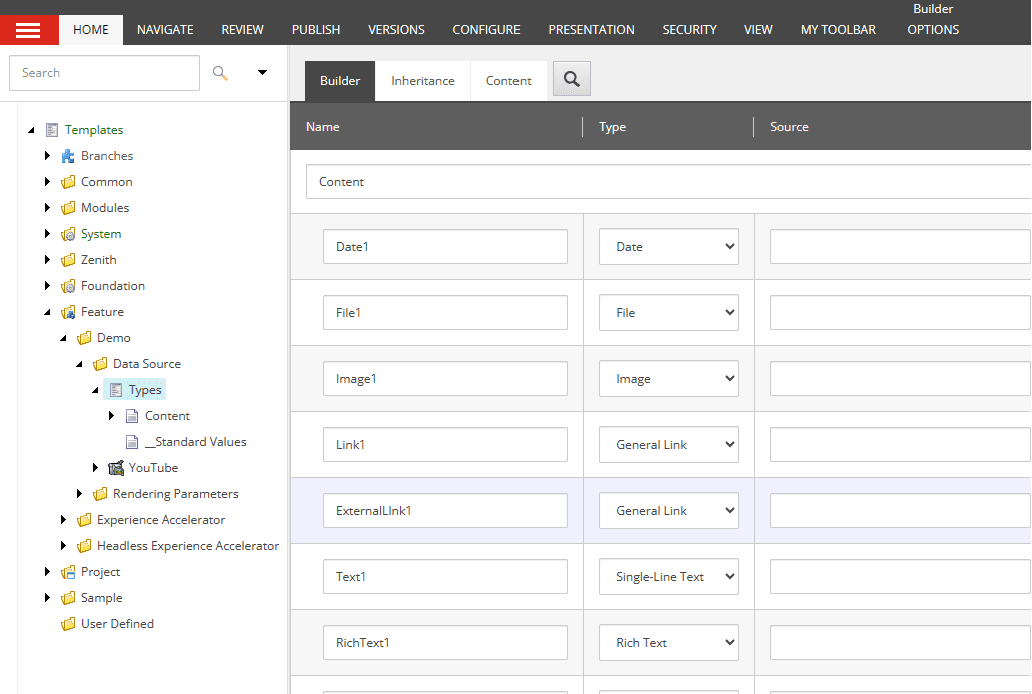
Each item that you have created subsequently will have more fields after the template is updated, so you will need to set up each of them.
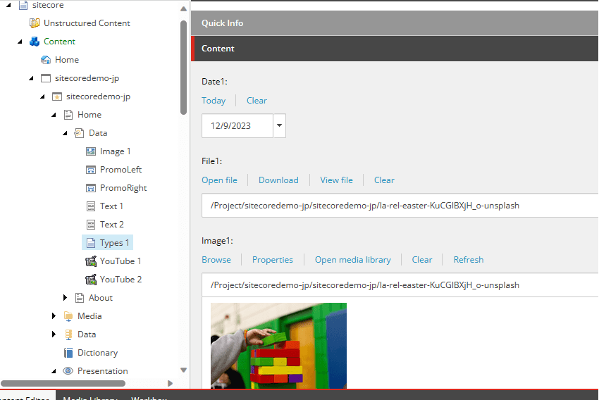
We are now ready to go. We will add code to the component.
Component Updates
Rewrite the code for the components you have already created as follows As for the names of the fields, if you have created them at hand, change them to those names, etc.
import React from 'react';
import {
  Field,
  Text,
  DateField,
  File,
  FileField,
  Image,
  ImageField,
  LinkField,
  Link,
  RichTextField,
  RichText,
} from '@sitecore-jss/sitecore-jss-nextjs';

interface Fields {
  Date1: Field<string>;
  File1: FileField;
  Image1: ImageField;
  Text1: Field<string>;
  Link1: LinkField;
  ExternalLink1: LinkField;
  RichText1: RichTextField;
}

type TestProps = {
  params: { [key: string]: string };
  fields: Fields;
};

export const Default = (props: TestProps): JSX.Element => {
  return (
    <div className={`component myrendering ${props.params.styles}`}>
      <div className="component-content">
        <div>
          <strong>Date Field: </strong>
          <DateField field={props.fields.Date1} editable={true} />
        </div>
        <div>
          <strong>File: </strong>
          <File field={props.fields.File1} target="_blank">
            View File
          </File>
        </div>
        <div>
          <strong>Image: </strong>
          <Image field={props.fields.Image1} editable={true} height="500" width="500" />
        </div>
        <div>
          <strong>Link: </strong>
          <Link field={props.fields.Link1} editable={true} />{' '}
          <Link field={props.fields.Link1} editable={false}>
            Internal Link
          </Link>
        </div>
        <div>
          <strong>External Link: </strong>
          <Link field={props.fields.ExternalLink1} />
        </div>
        <div>
          <strong>Text field: </strong>
          <Text field={props.fields.Text1} editable={true} />
        </div>
        <div>
          <strong>RichText field: </strong>
          <RichText field={props.fields.RichText1} editable={true} />
        </div>
      </div>
    </div>
  );
};
After changing to the above code, the following was displayed when checked in the Experience Editor.
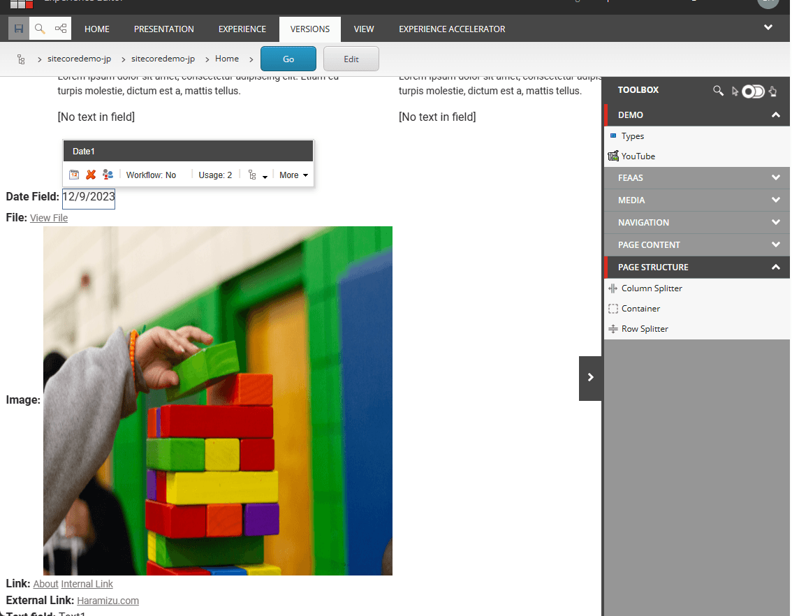
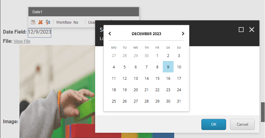
If you match the item with a date set as shown above, you will see a calendar icon appear. Click on the calendar icon to select a date.
For the file, an image file is specified this time. Clicking on the file will display it in a separate window. For example, if you want to change the text to be displayed,
          <File field={props.fields.File1} target="_blank">
            View File
          </File>
If you change the View File above, you can specify a PDF file and use the description "PDF Download".
As for links, we automatically get the title of the page if it is an internal link. If the same URL is fixed with a different name, we are able to change it by putting a letter between the Link tags. Also, for external links, the link title and other information is also included to ensure correct display.
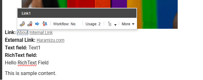
We have also confirmed that rich text can be displayed in the above image.
Summary
In this case, we only lined them up, but we were able to use the fields defined by the site core to display the content in a form. By using the standard components, the corresponding fields can be changed by editing them as you see fit.