In the previous article, we prepared only the language switching box so that you can add the Sitecore Search widget. This time, we would like to add the widget and display the search results.
Content Update
Please check the latest information on the following page
Add Widget
In this case, we will modify the project so that the widget can be used within the site. This procedure is provided below.
First, install @sitecore-search/cli into your project.
npm install --save-dev @sitecore-search/cliNext, create a file named .sc-search-settings.json and specify the path where the Widget will be placed. In this case, we created the following file.
{
  "components-path": "src/widgets"
}
Also, add the following code to package.json to enable the command to create widgets.
  "scripts": {
    "create-widget": "sc-search new-widget"
  },
You are now ready to go. Execute the following command to create the widget file
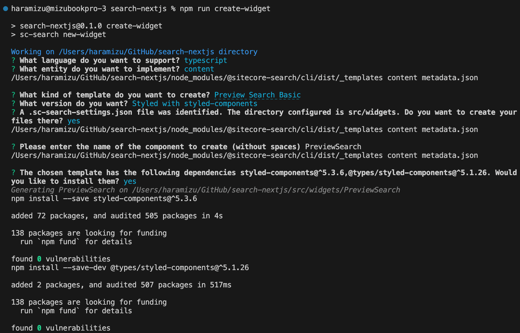
npm run create-widgetWhen executed, the questions and answers are repeated in a wizard format as shown below.

In this case, we proceeded as follows.
- Language - typescript
- Implementation entity - content
- Template- Preview Search Basic
- Stylesheet - Styled with styled-components
- File creation destination - .sc-search-settings.json is the folder specified ? - Yes
- Component Name - PreviewSearch
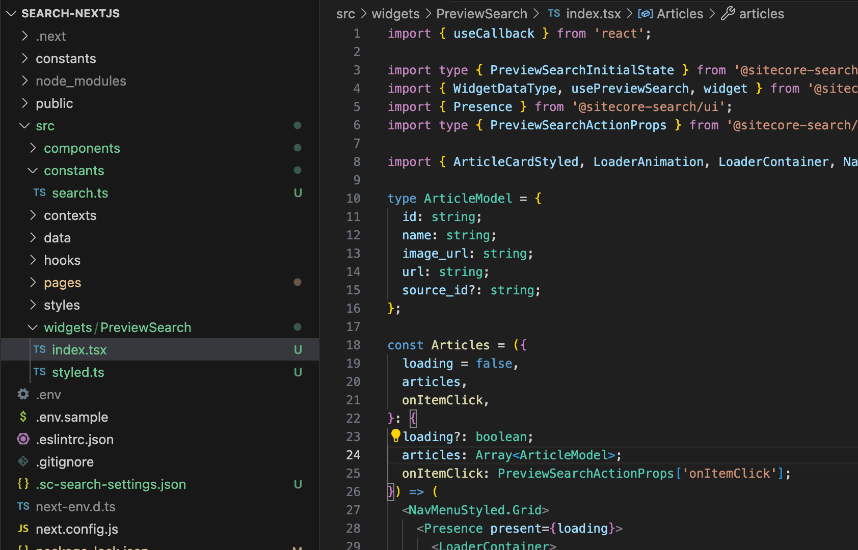
The following is the result of the execution.

The file is now under a folder.

Deploy Widget
Create the file src/components/HeaderInput/index.tsx as a component that uses the widget created this time.
import PreviewSearch from "@/widgets/PreviewSearch";

export default function HeaderInput() {
  return <div>{<PreviewSearch rfkId="rfkid_6"></PreviewSearch>}</div>;
}
We now have a component that calls the widget we created. We will now modify the file src/pages/_app.tsx to make this widget available. Note that the additional imports required are as follows: the locale call has already been included, but requires a separate entry.
import locales, { Language } from "@/data/locales";
import { PageController, WidgetsProvider } from "@sitecore-search/react";
import type { Environment } from "@sitecore-search/data";
import {
  SEARCH_ENV,
  SEARCH_CUSTOMER_KEY,
  SEARCH_API_KEY,
} from "@/constants/search";
import HeaderInput from "@/components/HeaderInput";
Next, we will add the code needed to use the widget. When using the widget, rewrite the code as follows, as it is possible to control the language using PageController.
export default function App({ Component, pageProps }: AppProps) {
  const [storageLanguage, setStorageLanguage] = useStorage(
    "lang",
    "en" as Language
  );
  const [language, setLanguage] = useState<Language>(storageLanguage);

  PageController.getContext().setLocaleLanguage(language);
  PageController.getContext().setLocaleCountry(locales[language].country);

  useEffect(() => {
    PageController.getContext().setLocaleLanguage(language);
    PageController.getContext().setLocaleCountry(locales[language].country);
    setStorageLanguage(language);
  }, [language, setStorageLanguage]);
You are now ready to Implement the components for the widgets we have just created. In this case, we are using WidgetsProvider.
  return (
    <LanguageContext.Provider value={{ language, setLanguage }}>
      <WidgetsProvider
        env={SEARCH_ENV as Environment}
        customerKey={SEARCH_CUSTOMER_KEY}
        apiKey={SEARCH_API_KEY}
      >
        <LocaleSelector />
        <HeaderInput />
        <Component {...pageProps} />
      </WidgetsProvider>
    </LanguageContext.Provider>
  );
Now you are ready to go.
Verification of Operation
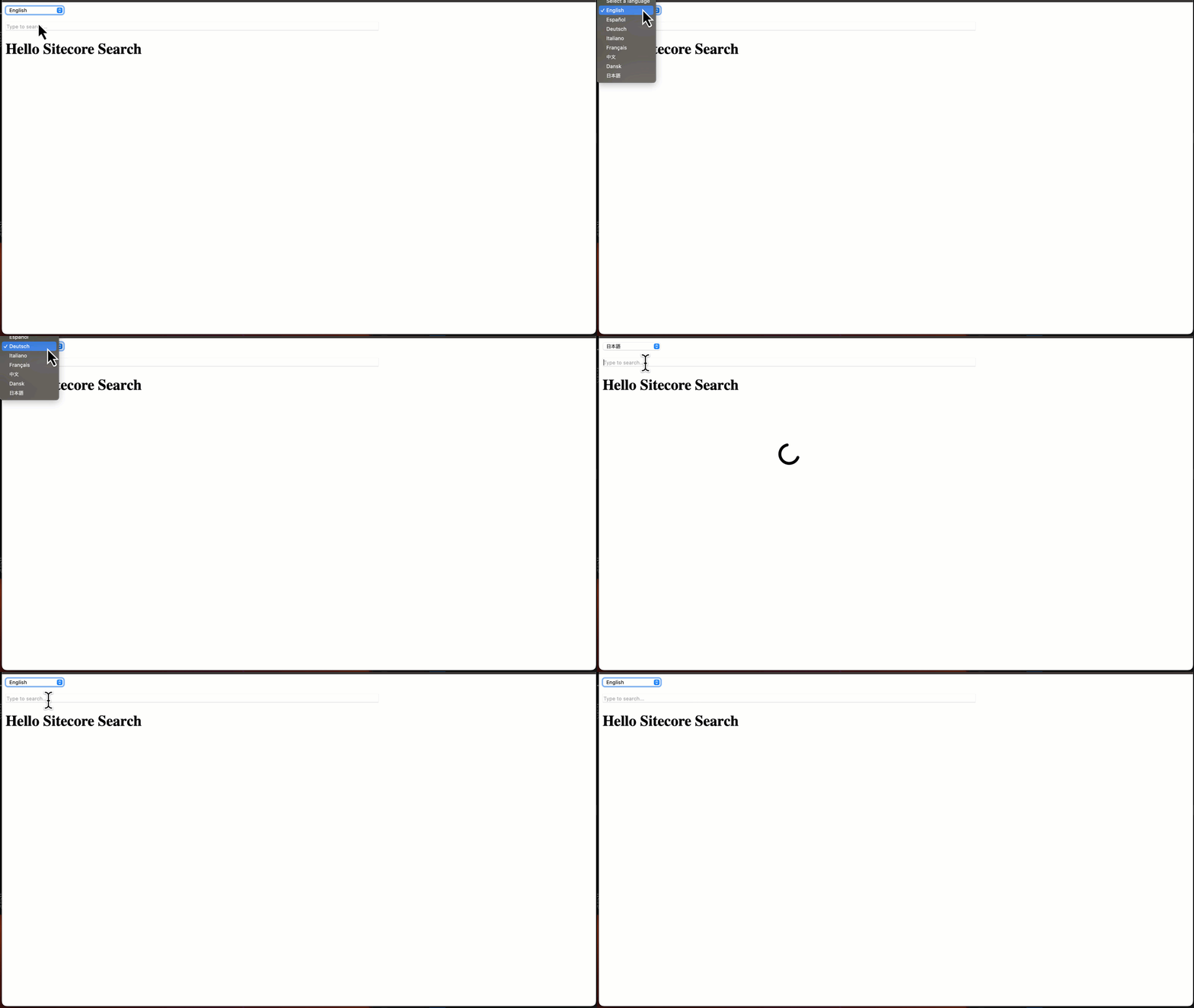
If you actually run npm run dev, you will see that it works as follows.

Putting it all together in a header file
We are already in a situation where components are lined up against the _app.tsx file, but we will put together the components to be used as a header. First, create the following file as src/components/Header/index.tsx.
import HeaderInput from "@/components/HeaderInput";
import LocaleSelector from "@/components/LocaleSelector";

export default function Header() {
  return (
    <div>
      <LocaleSelector />
      <HeaderInput />
    </div>
  );
}
Then add the following statement to modify the src/pages/_app.tsx file where the components are lined up.
import Header from "@/components/Header";Remove the LocaleSelector and HeaderInput component imports used in the above components and replace them with <Header /> where applicable.
      <WidgetsProvider
        env={SEARCH_ENV as Environment}
        customerKey={SEARCH_CUSTOMER_KEY}
        apiKey={SEARCH_API_KEY}
      >
        <Header />
        <Component {...pageProps} />
      </WidgetsProvider>
Now the components used in the header are collected in the header component. The result of the operation is exactly the same.
Summary
We were able to confirm that the previous language selection drop-down box and the widget are working together to display the search results. The code up to this point is available as a branch in the following repository.
