
You can switch between light and dark modes on the website. I personally use the dark mode. In this article, I will confirm the procedure to implement this in NextUI.
Implement a dark mode.
First, install the module for using dark mode in your project as follows
PowerShell
npm install next-themesAfter installation, use next-themes to rewrite the page app\providers.tsx.
TypeScript
// app/providers.tsx
"use client";

import { NextUIProvider } from "@nextui-org/react";
import { ThemeProvider as NextThemesProvider } from "next-themes";

export function Providers({ children }: { children: React.ReactNode }) {
  return (
    <NextUIProvider>
      <NextThemesProvider attribute="class" defaultTheme="light">
        {children}
      </NextThemesProvider>
    </NextUIProvider>
  );
}
Next, delete all the Classes listed in the file app\globals.css, leaving only the following lines
CSS
@tailwind base;
@tailwind components;
@tailwind utilities;
Finally, to increase the number of buttons to be displayed, line up the buttons in app\page.tsx as follows
TypeScript
<div className="m-8 flex flex-wrap gap-4 items-center">
<Button color="default">Default</Button>
<Button color="primary">Primary</Button>
<Button color="secondary">Secondary</Button>
<Button color="success">Success</Button>
<Button color="warning">Warning</Button>
<Button color="danger">Danger</Button>
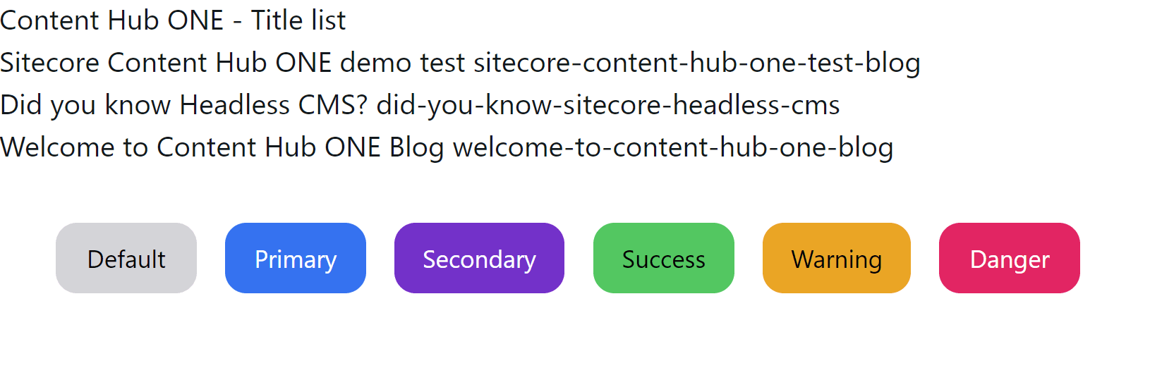
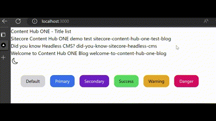
</div>If access is made in this state, access can be made in light mode as shown below.
Add a button to switch
The sample code for the button is also on the above page. In this case, we have created a file named components\button\ThemeSwitcher.tsx and prepared the following code.
TypeScript
// components/button/ThemeSwitcher.tsx
"use client";

import { useTheme } from "next-themes";
import { useEffect, useState } from "react";
import { BsSun, BsMoon } from "react-icons/bs";

export function ThemeSwitcher() {
  const [mounted, setMounted] = useState(false);
  const { theme, setTheme } = useTheme();

  useEffect(() => {
    setMounted(true);
  }, []);

  const handleSetTheme = () => {
    setTheme(theme === "light" ? "dark" : "light");
  };

  if (!mounted) return null;

  return (
    <div>
      <button className="block p-1 rounded-full" onClick={handleSetTheme}>
        {theme === "light" ? (
          <BsMoon className="w-5 h-5" />
        ) : (
          <BsSun className="w-5 h-5" />
        )}
      </button>
    </div>
  );
}
This code uses react-icons, so please add it to your project as follows
PowerShell
npm install react-iconsbutton to switch between the two.
Summary
NextUI is only recently released and offers easy access to dark mode. While I sometimes think this is unnecessary for corporate sites and the like, it is a useful feature for those who want to make their document sites easy to read for visitors.